This article is written by Ramanuj Mukherjee.
Table of Contents
Introduction
Most lawyers have no websites at all. A lot of them have really terrible ones. Finding a good legal website is quite a rare occurrence. Why is that?
Primarily because most lawyers have no idea about how to use a legal website properly. Many lawyers think of the website as some kind of appendage for the business, they are supposed to keep up the appearances by having one but they are not sure why. There are notable exceptions, but they are so few that we can’t help but think of them as exceptions.
Clients need to see that this law firm has a website.
Beyond that, what else?
This is, unfortunately, a great waste of a fantastic opportunity.
In this article, let us explore how to use the website of your law firm in the most useful way, to generate real RoI.
Are lawyers even allowed to have a proper website in India?
There is an archaic BCI rule that says you are not supposed to have any information on your website apart from name, address, personal qualification, area of practice and contact details. Now that leaves very little scope for anything else, vide Rule 36, Section IV of the BCI Rules.
“In India, An Advocate shall not solicit work or advertise, except through a medium maintained by the Bar Council of India, either directly or indirectly, whether by circulars, advertisements, touts, personal communications, interviews not warranted by personal relations, furnishing or inspiring newspaper comments or producing his/her photographs to be published in connection with cases in which he/she has been engaged or concerned.
His/her sign-board or name-plate should be of a reasonable size. The sign-board or name-plate or stationery should not indicate that he/she is or has been a President or Member of a Bar Council or of any Association or that he/she has been associated with any person or organization or with any particular cause or matter or that he/she specializes in any particular type of work or that he/she has been a Judge or an Advocate General.
Soliciting work or advertise “as used in this clause of the Code would not mean and include setting up of a web-site by an advocate or a law firm giving only basic information about the names and number of lawyers in a law firm, the contact details and areas of practice. This would apply similarly to lawyers’ brochures and law directories.”
Also, you should have the following text or something along those lines on your website, whether as a popup banner or in the footer section:
“As per the rules of the Bar Council of India, we are not permitted to solicit work and advertise. The user acknowledges that there has been no advertisement and personal communication from A&A, any information obtained or material downloaded from this website is completely at the user’s volition and any transmission, receipt or use of this site would not create any lawyer-client relationship. In cases where the user has any legal issues, he/she in all cases must seek independent legal advice.”
The idea is simple.
You would not, directly or indirectly, approach or coax anyone for hiring you for your legal services.
Does that mean a lawyer cannot have an effective website, with further content?
Not really.
You may have seen big law firms and many others having a lot more information about their practices, mention of awards and recognitions, past clients, newsletters, blogs and so much more. How is it possible?
Is this not violative of BCI Rules?
The argument is that if a client finds you on their own and then requests information, it is neither advertisement nor solicitation.
So anyone who lands upon a law firm website is made to accept a disclaimer that they are requesting information, and thereafter they may be given any information whatsoever.
This is also based on this principle – if you go and distribute your law firm’s brochure to strangers, this is a solicitation. But if strangers come to you and request to receive a brochure, then it is kosher.
You can trust lawyers to find ways around rules. We make stupid rules and then find smart workarounds.
In any case, this workaround has come to be accepted through wide-spread practice. BCI has not taken any action on such websites over the last 20 years and now almost every law firm does this in India.
Unfortunately, merely keeping a website is not enough to work wonders for your legal business. That is exactly where most law firms and lawyers go wrong.
What kind of disclaimers are taken from visitors before they can proceed to access the law firm’s website?
Here is one from AlgoLegal.
Attorney disclaimer
By clicking “I Agree” below or by accessing this website, the user agrees that:
- There has been no advertisement, personal communication, solicitation, invitation or inducement of any sort whatsoever from Algo Legal (the “Firm”) or any of its members or personnel to solicit any work or advertise through this website;
- The purpose of this website is to provide the user with basic information about the Firm and its practice areas;
- The information about the Firm is provided to the user only at the user’s specific request and any transmission, receipt or use of this website will not create any lawyer-client relationship. The Firm hereby disclaims any and all liability to any person for any loss or damage caused by errors or omissions, whether such errors or omissions result from negligence, accident or any other cause.
- The Firm is not liable for any consequence of any action taken by the user relying on material/ information provided under this website. The contents hereof should not be construed as legal advice in any manner whatsoever. In cases where the user requires any assistance, the user must seek independent legal advice.
Your law firm website is the centrepiece of your business development efforts
Here is what you want to use your website for:
- Developing a brand perception – your colour palette, choice of language and images, kind of content you showcase on homepage or blog – everything creates a brand perception.
- Let existing and potential clients discover more about the range of services you offer.
- Dissemination of information about your practice, so the potential clients who visit your website can determine whether you are the right fit for them or the work they have on mind.
- Educating your potential clients or target market about important legal issues and insights that can be beneficial for them.
- Showcasing the best content you and your colleagues may have created – could be articles, blog posts, videos or podcast.
- Capturing contact details for visitors and keeping in touch with them through a newsletter.
- You want it to rank high on Google in case someone searches for your name, firm’s name or even certain kind of legal work.
You can expect most clients to visit your website before they engage you. What they see in the website will have a major role in their decision making.
A lot of law firm websites look like they belong to the 90s
Even many of the top tier firms are guilty of this. Their website looks like a relic of the simple HTML websites from the 90s when Flash was the norm and nobody ever heard of JavaScript! Often the design and the user interface are clumsy and reflect poorly on their brand.
For example, the website of one of the firms I worked at only had the name of their partners and HODs, the human resources head and a few key personnel, their phone numbers and their email addresses on the home page.
Imagine a visitor lands on the home page of that website, would they consider navigating further or hiring this firm for their legal needs? I doubt that the website does much to convince the visitor to hire this firm. Luckily, the firm was old and most of their work came from referrals, word of mouth or existing clients.
However, if they had a great website that showcased their best lawyers, their scholarship and breadth of knowledge through high-quality content, and allowed visitors to engage or stay in touch through a newsletter, and put in effort in developing a brand perception, would that have helped? I would think so.
What features are a must for your website?
Communication
Use your website for lead generation and service requests. Allow visitors to initiate contact if they want legal services – such as submit a query or request for a quote on the website.
They should also be able to schedule/ request to schedule a meeting with you through services like Calendly.
Initiating contact with lawyers is often not easy, and given how busy lawyers are, clients struggle to get in touch. And if you make this easy, potential clients will really appreciate it. You are lowering the barrier for getting in touch, after all. Which is great!
It is also possible to install a chat client on your website, to make it even easier, but then you have to see if it’s worth the time and effort. Testing it out is the best way to know.
Blog
It is important to have a blog of your law firm. It is not necessary to be available on social media or to get a lot of traffic on the blog. The intention here is the people who come to your website, if they are your ideal client, they will really like the content they see in your blog.
It is a way for them to validate their idea of working with you. They can see who you are and what your practice or firm is really about from the content you showcase in your blog. Do not underestimate the power of a good well-curated blog on your law firm website.
Here, quantity is not important. Quality and curation are crucial.
For instance, CAM has not one but multiple blogs. Here is one on corporate law: https://corporate.cyrilamarchandblogs.com/
One on competition law: https://competition.cyrilamarchandblogs.com/
Give away & free resources
What if you give away some free templates for your potential clients?
Here is an example:

AlgoLegal gives away free templates for startups and entrepreneurs, their target client group: https://algolegal.in/free-legal-templates/
Once you will try to download any template, the website will ask you for your contact details.
However, if you try to collect the information you need to give away high-quality freebies because those who download those freebies will judge you by the quality of that content.
Newsletter sign ups
You can separately offer a newsletter sign up form, as a pop-up form, exit-intent triggered, or even somewhere on your home page.
Someone may not engage you the first time they visit your website. But if you stay in touch, or help them to get to know you better through your educational and helpful content, that can change the equation.
You can see how seriously a law firm like Linklaters takes its newsletter services here: https://www.linklaters.com/en/about-us/newsletter-signup
Showcasing services and offerings
Take a look at the Allen & Overy website here. It will tell you how important it is for them to showcase their best content to visitors, and that they are showcasing their popular and new practice areas on their homepage very effectively.
Take look at the home page of A&O to get a sense of what the home page of a big international law firm looks like https://www.allenovery.com/en-gb/global
Trilegal does it in a low key but classy way: https://www.trilegal.com/index.php/practice-areas
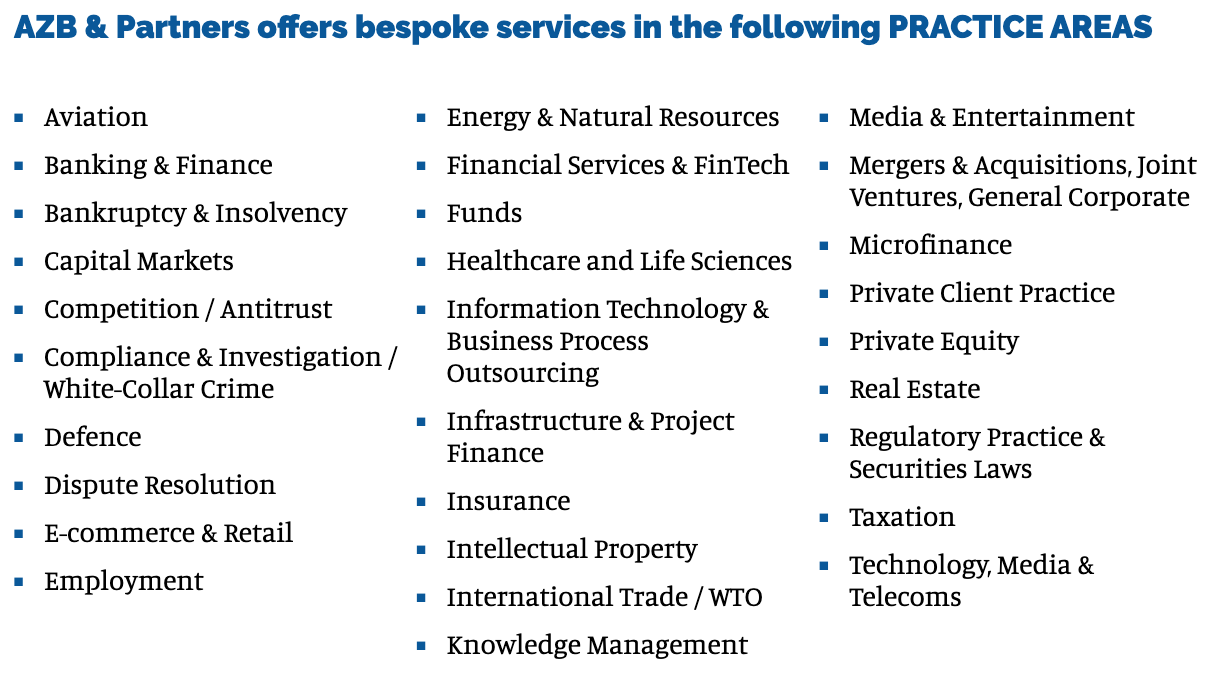
Here is how AZB & Partners does it on its home page:
Showcasing your research, knowledge resources, latest news and top content
Showcasing the depth of your knowledge, research and educational content is very important for law firms and lawyers. Yet, most do not do a good job of it.
Within India, Nisith Desai and Associates do this really well. Take a look at their website here: https://www.nishithdesai.com/. NDA churns out a massive amount of content every week, including a lot of very detailed white papers and videos: https://www.nishithdesai.com/information/home.html
Here is the knowledge bank of AZB: https://www.azbpartners.com/knowledge-bank/
Trilegal is doing a series of videos with its partners called Unlocked: https://www.trilegal.com/index.php/unlocked
Here is how Baker & Mckenzie showcases its firm-related news: https://www.bakermckenzie.com/en/newsroom
Branding
Lisa Gansky said, “A brand is a voice and a product is a souvenir.” Strangely enough, very few businesses understand that, including law firms. A brand is not about choosing a particular colour combination, using catchy one-liners or fighting a price war.
If your business (or law firm) were to be personified, how would it be? Would it be a serious individual in suits and sunglasses, or would it be someone in flowery shirts and Bermuda shorts? Would he use short, simple sentences or be rather convoluted in its speech? Imagine your legal business as a “human personality” and try to determine how it should make you feel when he walks, laughs and pitches business.
Tip: Branding is EVERYTHING and nothing at the same time. Only an expert will be able to help you in figuring out what works best for your business.
The brand also shows up in the way you design your website. A website will be used by every potential client to judge you.
Gone are the days when the market expectation was rather low and even flash websites could capture the heart of your audiences. When every entity on the internet has gone through several degrees of sophistication and remarkability, your law firm website has got to be sleek and captivating. Nothing else works.
You can get your website brimming with life and vigour. I really love the AlgoLegal website from this perspective. It talks to its user base – entrepreneurs and founders. The branding is absolutely on point, and the website very sleek. It inspires confidence.
According to Statisticbrain.com, the average length of the attention span of a website user is eight seconds, and only 28 per cent of the text on a web page is read on average. So, instead of going for a text-heavy website, you can reduce text, increase multimedia content and ramp up on the interactivity of your website.
Exactly what you will see the top foreign law websites doing!
Tip: A “talking” website is much better than a mute one. Ask your web designer to infuse life into your website. He would know how to do it.
Unique Selling Proposition (USP)
Last but not least, when a prospective customer lands on your website, the only question that plays in his mind is, “Is this the law firm to solve my legal problems?” Nothing else matters really. If your client wants to order your services, what concerns him is, “why should I go for this law firm and not anyone else?”
The answer that you come up with is your unique selling proposition (USP). Your USP screams out your “why” behind the law firm and also satisfies the client’s personal concern of getting his particular problem solved. His unique problem is best solved by your knowledge and expertise. Also, the payment structure you follow, the location of your firm, the specialization of your firm (if any), the customer service… everything fits nicely with the wants and needs of your prospective client.
Tip: Read the “Start with Why” book by Simon Sinek, and figure out what makes your law firm better than the rest.
I find the website of Ikigai Law doing a great job here. https://www.ikigailaw.com/#acceptLicense
After seeing it, you will be very clear as to what their focus is. Everything drives at its USP – we work with complex tech and legal issues related to them. There is absolutely no ambiguity.
This really helps the right customers to understand what you are all about.
Which 3 lawyer websites totally nailed it?
Below I will talk about which features I really liked in some of the top law firm websites in India.
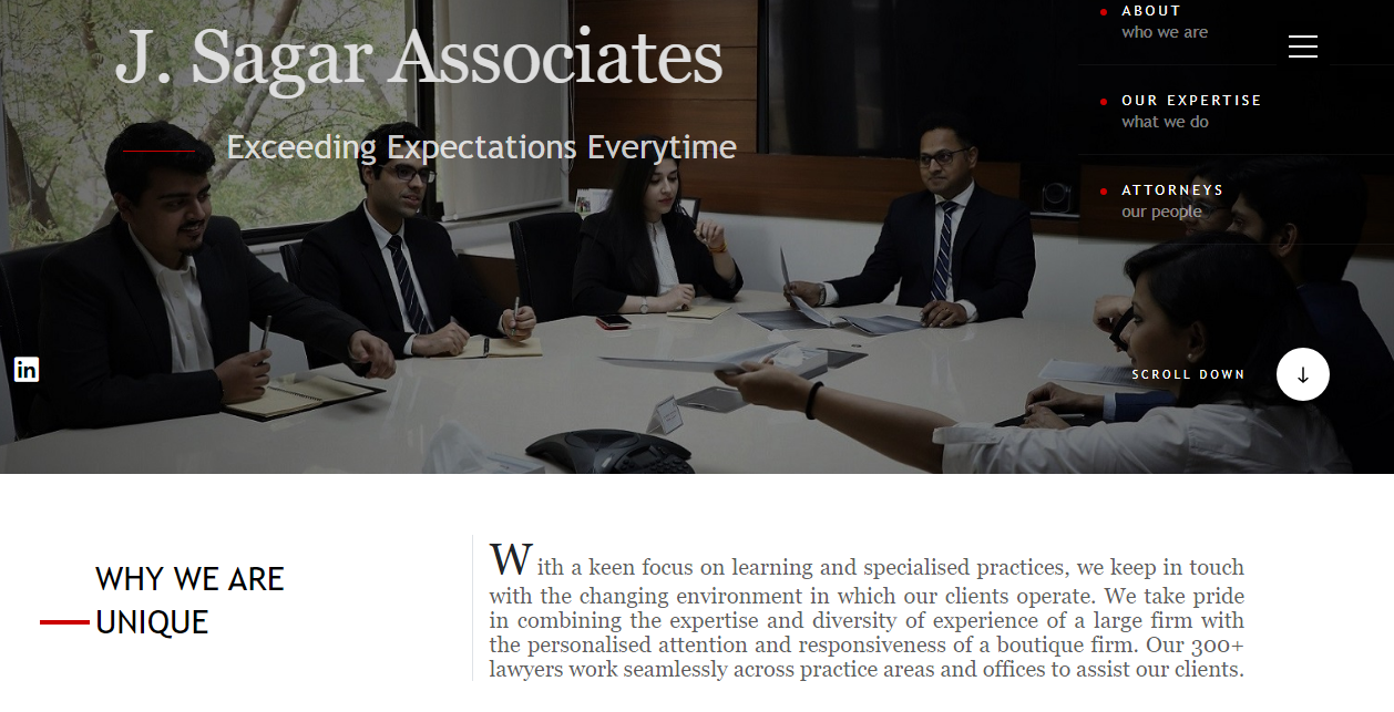
J Sagar Associates’ website gives off a professional and lawyerly vibe. While they mention their areas of expertise, the testimonials, the historical statistics of the firm and such, it starts with the uniqueness of the firm right below the header background image like below.
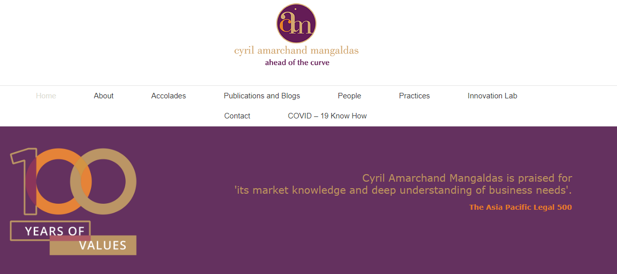
CAM focuses on “100 years of values” with a review from the Asia Pacific Legal 500, with reiterating on why it is India’s leading law firm in a few bullet points that talk about it being the largest full-service law firm, about artificial intelligence in legal works, about Prarambh and Gurukul.
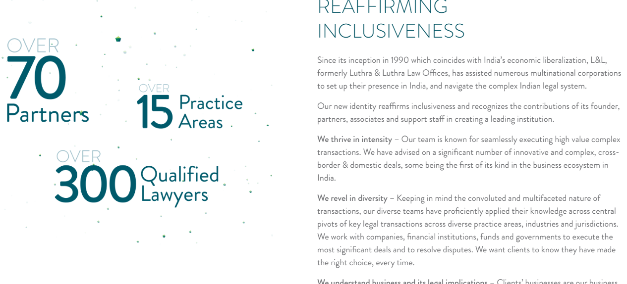
While Luthra and Luthra’s home page is not that catchy to the layman visitor, I dig the ‘About Us’ page where they used a cool animation on the left and the copy on the right focused on what made Luthra and Luthra special in terms of their methodology, ideology and technology. On the left side, they are tickling your left brain and on the right, they are tickling your right brain.
 Oh, a bonus one!
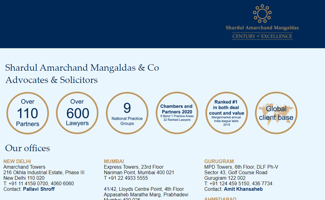
While SAM’s website is rather bare-bones, honestly speaking, I like how they have kept it simple and to the point. It’s like they are saying, “On the top, you see all the reasons why we are the best, and on the bottom, you get to know how to hire us.”
How much would such a website cost?
Actually, the question should be the other way round.
It depends on your budget.
If you hire a top-notch designing agency, it might run to even a few lakh rupees. And if you hire a freelancer off Fiverr, it might cost you as low as Rs 5000.
Any decent web development agency will charge you upwards of 50k for a high-quality website.
You can build it yourself using tools like Wix if money is short.
However, please invest in your website. You will definitely get a good return on it if you do a good job. Good design and good developers are expensive. Can’t be helped!
Even if you spend a lakh on your website, and clients who pay 50k per person will go through the website before hiring you, I think it makes total sense to make that investment.
Remember, apart from design, good content costs either money or time too.
How to promote it without flouting BCI rules?
That’s a very good question.
You sure do have the website now. But how should you promote your services online?
I will talk about it in my next email.
So stay tuned.
But here’s the gist of it though.
Since BCI knits its brow at anything that directly or indirectly advertises your legal business, what we suggest would not include any advertisement of your services at all. Instead, we will take a far more effective and steadier approach that might seem hard to execute but will be more profitable in the long run.
In the meantime, I have homework for you.
Visit these three sites:
- Fiverr.com
- Upwork.com
- Freelancer.com
Talk with a few freelancers over there and check out their services. Come back to me and tell me what problems you faced in getting your legal website done. We might be able to help you with a solution, who knows.
Also, please check out the Legal Practice Management program which helps people to rapidly grow their law practices and attract more clients.
Looking forward to hearing from you.
To your success,
Ramanuj Mukherjee & Suman Chatterjee
LawSikho
S. LawSikho is running hour-long webinars every day. Want to learn how to improve your learning skills? Prepare an LLM application to a foreign university? Career opportunities in new, upcoming areas of law? Don’t miss these high-quality webinars with industry and academic experts.
Reply back to this email stating “I want to watch webinars!” and we will personally send you the link to the webinar group on WhatsApp. From then onwards, you will receive instant webinar notifications on your mobile phone only.
TOMORROW’S WEBINAR SCHEDULE
Topic: Dual Licensure (from a New York Perspective) and Antitrust Law (India and USA)
Hosts: Ekakshra Mahajan, Samyuktha Banusekhar and Ashutosh Pandey
Time: 12:00 pm
P. S. All our premium courses are covered under an unwavering 45 days full money-back guarantee.
After taking a course, if you feel like it is not working out for you, maybe you are not getting enough value out of it or it is not meeting your expectations, just get in touch with us. We will refund every rupee you paid for the course.
No questions asked, as long as the minimum requirements of the refund policy are fulfilled.
LawSikho has created a telegram group for exchanging legal knowledge, referrals and various opportunities. You can click on this link and join:
 Serato DJ Crack 2025Serato DJ PRO Crack


 Allow notifications