
This article has been written by Swayamsiddha Das, pursuing the Diploma in Intellectual Property, Media and Entertainment Laws from LawSikho.
Table of Contents
Introduction
With a vision of being the e-commerce giant Jeff Bezos launched Amazon. In the early days, Amazon was not the e-commerce giant that we see today, it was previously selling books online. After being a success Bezos tried to expand Amazon and made it an online store that sold everything. From selling books to being a store where everyone has something for themselves, Amazon has surely become the biggest internet-based company. As Amazon was evolving in the line of business so was its logo in this article we would see the history behind the change in the Amazon logo. 
A brief history behind the name “Amazon”
Amazon was not the initial name that Bezos thought of. The initial name of Amazon was supposed to be “Cadabra” but eventually had to give that name up as people started pronouncing it as “Cadaver” which means dead body. After searching through a lot of domain names they finally settled on Amazon and relentless as both these names fit with Bezos’ vision. To point out an interesting fact, today, if you type relentless.com on your search bar the internet will directly take you to the Amazon home page.

Having said this, Amazon has seen multiple changes in its logo. But the question is why was there a need to redesign it? What are the guidelines provided by the USPTO for making such amendments in a registered logo? When should a company go for redesigning a logo?
Series of changes in the logo
The Amazon logo, unlike other brands, has always been very simple and aesthetic. The main reason behind this minimalistic look was that Jeff Bezos did not desire a huge branding design budget. The color palette that was used in the logo was also not vibrant; it was the simple color combination of black and white.
Amazon after being launched tried to experiment a lot with its logo. To understand the evolution of the logo, we need to travel back in time, to 1995:
1. For the years 1995-1997

Here is how Amazon looked when it hit the e-commerce platform. This initial Amazon logo was designed by Turner Duckworth. The idea behind this Logo was to connect the consumers with the ideology of the Brand. The logo’s main element was a stylized black strong letter “A” with a smooth vertical white line that matched the Amazon river’s features.
2. For the years 1997 -1998

The logo was again updated in the year 1997, this time the logo was seen with white horizontal lines emerging from the Amazon river, the reason behind the entire stripe pattern was that these lines began to resemble not only the river form, but also a tree, and it had some similarities with the zebra pattern, making it unique. This logo’s color palette was still monochromatic. The wordmark’s design was somewhat altered, and the writing was made bolder, while the symbol was recreated and reduced in size and more beautiful.
3. For the year 1998

The year 1998 was considered to be a significant year for the company’s visual identity. In this year, three distinct logos for Amazon were designed. The first was a basic wordmark which was “amazon.com” written in a beautiful serif style font, with the tagline “Earth’s Biggest Bookstore” printed in full caps in a plain and rigid sans-serif design at the bottom with the color combination of black and white.

The second design for Amazon consisted of a new color scheme i.e. black and bright yellow that was designed for the upcoming edition. The logotype’s characters were now capitalized, and the letter “O” was now written in bright yellow color and was a bit enlarged. This time the tagline of “Earth’s Biggest Bookstore” was removed.
But sadly this redesigned logo of Amazon only lasted for six months and was soon replaced by a new one at the end of the year, and this changed logo at the end of the year laid the foundation of the Amazon logo that we all know today.
4. For the years of 1998-2000


At the end of 1998, the so-called iconic “Swish” logo was developed. Even if this was very basic, it somehow had a fresh, new approach and enthusiasm like every prior version. The significance of this Swish was that it symbolises the connection of Amazon between the past and future. In this design, Amazon was written in an Officina bold text font.
5. For the years of 2000–present day

In the year 2000 finally, the logo of Amazon that we all associate with and see in the boxes was designed. The above design was considered to be the logo of the new generation and technological advancement as it gives the message of “An Everything Store” where every product from “A” to “Z” was available to all. Apart from this, the design also reflects the company’s “positive” and “progressive” approaches.
The current Amazon logo consists of the wordmark Amazon with a bright yellow arrow coming under alphabets “A” to “Z”. which if looked closely looks like a smile. This smile designed by Turner Duckworth gave a friendly and joyful vibe. The color scheme of the classic black and bright yellowish-orange gave the logo a simple, bright, and vibrant look overall. But as soon as the brand started expanding the “.com” wordmark was also removed from the logo.
The Amazon logo of the 2000s displays the absolute best in modern simplicity and style. This was the entire history behind the evolution of the Amazon logo. Now that we have looked into the history we must try to understand when a company needs to redesign its logo and what all things should the company keep in mind by doing so. If you are thinking of redesigning your logo you need to ask yourself a few questions to make a conclusive decision. You can start with simple questions like:
1. Whether your business dynamics have changed or expanded?
If your business is trying to launch a new line of products or over the years you have seen exponential growth in your business, then in that case you can go for the redesign of your logo.
2. Have you encountered a new direct competitor in the market?
If you have always been a top solo player in the market for years and suddenly feel intimidated by the launch of a new brand and are direct competitors, in that case, you can give logo redesigning a chance as a little modification to your logo would make the consumers believe that your brand is always keeping up with the current times and trend. Therefore, redesigning would be like brownie points for your brand.
3. Is your logo design very old?
It is normal for your business to adapt as it expands. If you realize that your company’s public persona has changed since its inception, your logo should represent these changes.
4. Have the values or mission of your brand changed?
It’s a basic and apparent question, yet it bears asking. If your logo was designed in the 1980s, it might be a calling for you to update it. Not only is the look old, but the design is possibly incompatible with the plethora of modern gadgets that will display your logo on them.
USPTO view on redesigning of logo
The trademark practice in the US is very unique as compared to other countries. To maintain your trademark registration in the US, it must be used exactly as it was registered. But a wordmark, on the other hand, maybe used in any typeface, stylization, layout, size, or color, whilst a black and white design mark can be used in any color or size.
Brands and marketing campaigns often change as the company matures and heads towards market expansion along with this the trademarks also get changed frequently. Sometimes a business will create a new trademark and brand identification for a product that has nothing to do with the previous mark. As seen in the case of Amazon in the previous case.
Existing trademark registrations can be amended under US trademark law as long as the modifications aren’t “material” and don’t impact the trademark’s “commercial image.” The ability to modify an existing trademark registration is extremely desired since it retains the old trademark registration as well as all of its related dates.
It must be noted that when the current mark remains in use and its use is not completely abandoned, then a new application/registry should not be altered and should coexist with the existing registration. The USPTO has laid down few guidelines for altercation and amendments:
1. Permissible altercation
- Modernisation of minor design modifications,
- Elimination of non-distinctive words,
- Amending a word to two or vice versa,
- Rearranging elements in the mark,
- A black and white drawing to a color drawing.
2. Impermissible alterations include
- Fixing of spelling errors in the logo/mark,
- Added or deleted punctuated mark which impacts the trademark.
Legal changes faced by Amazon’s logo recently
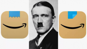
- Recently Amazon launched an icon bearing a blue tape over the Amazon smile. However, unlike the other redesigned logo this was not very well appreciated and received by the consumers as Amazon’s new icon with a blue tape over the Amazon smile resembles the Nazi Dictator, Adolf Hitler. This led Amazon to silently update the symbol by folding the blue tape following consumer comments.

2. In the year 2005, Amazon began its Prime membership. In its delivery vehicles, the business started utilizing the term Prime. In Missouri, this grabbed the notice of a trucking business. Prime, Inc., a 50-year-old company with more than 12 000 lorries with identical designations. His complaint alleges that the two logos confuse his clients already. Amazon must stop putting the Prime mark on its lorries and compensate for losses. The complaint requests A trial of the jury will take place in February 2022.
Conclusion
Amazon is the prodigy of the internet boom in the mid-’90s. Just like every trademark the entire purpose of the Amazon logo is to ensure that the public can recognize the goods of the business in one look. But then as Amazon started to expand to a company worth million dollars so did the logo but the constant redesigning of the Amazon logo from reflecting the “Amazon Forest” to be “A store of Everything” has not once changed its dynamics with its customers and would always be an example of businesses who have always evolved with time. It will be interesting to observe what tweaks they make in the future and how they continue to use their logo as part of their distinct branding plan.
References
- https://blog.logomyway.com/history-amazon-logo-design/
- https://1000logos.net/amazon-logo/
- https://www.fineprintart.com/history-of-the-amazon-logo/
- https://99designs.com/blog/tips/logo-redesign/
- https://grr.com/publications/why-refile-when-you-can-amend-permissible-amendments-to-u-s-trademark-registrations/
- https://secureyourtrademark.com/blog/amazon-logo-history/
Students of LawSikho courses regularly produce writing assignments and work on practical exercises as a part of their coursework and develop themselves in real-life practical skills.
LawSikho has created a telegram group for exchanging legal knowledge, referrals, and various opportunities. You can click on this link and join:
 Serato DJ Crack 2025Serato DJ PRO Crack


 Allow notifications